UX Research · Interaction Design · Conceptual Redesign · 2025

Robot delivery was faster, cheaper and sustainable. So why didn't anyone trust it?

A redesign of the post-order robot delivery experience inside UberEats — because the problem wasn't the robot. It was the silence.

Conceptual redesign. Not affiliated with Uber Technologies or Serve Robotics.

RoleUX Researcher & Interaction Designer Timeline10 weeks TeamSolo · Academic Capstone ToolsFigma · FigJam · OptimalWorkshop
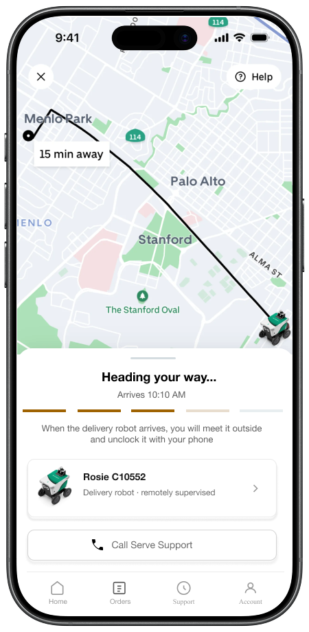
Screen 1
Screen 2
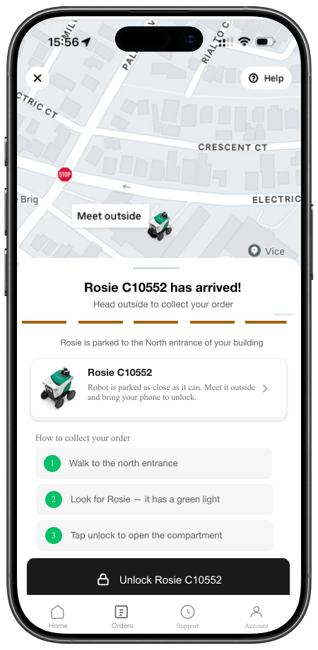
Screen 3
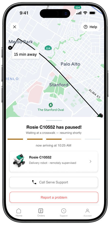
Screen 4
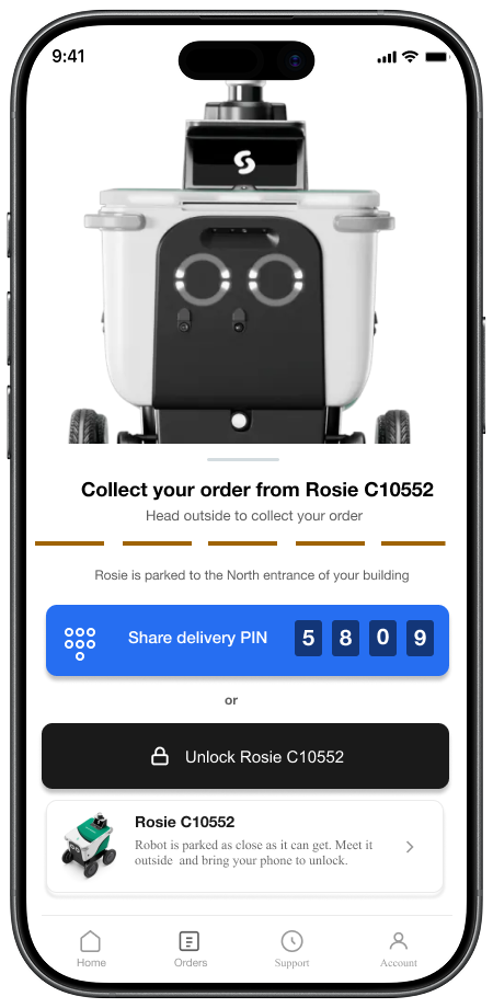
Screen 5
01 Problem 02 Accessibility 03 Personas 04 Research 05 Findings 06 Redesign 07 Results 08 Reflection

Robot delivery existed.
The experience didn't.

Serve Robotics is already live on UberEats across several US cities. When you place an order and a robot is assigned instead of a human courier — the app experience completely breaks down.

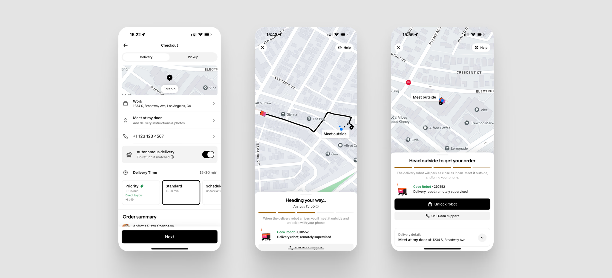
UberEats current robot delivery experience shows users exactly 3 screens, regardless of which robot company is delivering. No robot identity. No real-time status narrative. No pickup guidance. No error handling. Just a dot on a map.

Our research showed that users weren't afraid of robots. They were afraid of silence. The anxiety came from not knowing where the robot was, where exactly it would stop, and what to do when something went wrong.

Evidence: Coco Robotics current UberEats integration — 3 screens. For the most anxiety-inducing moment in the entire delivery experience.

cocodelivery.com · Coco Robotics × UberEats integration ↗
01

No one knows where the robot is when it gets stuck or pauses unexpectedly

02

No one knows where exactly it is parked outside — users physically search for it

03

No live updates when it's on the way, and no communication at all when something goes wrong

Coco Robotics current UberEats integration — 3 screens

3 screens. For the most anxiety-inducing moment in the entire delivery experience.

The people who need this most
are the ones it fails hardest.

Robot delivery has enormous potential for people with disabilities like those who struggle to leave home, wheelchair users, people with severe anxiety, elderly users. Autonomous delivery removes the barrier of human interaction. But the current UX makes it worse, not better.

Real incident — Sep 2025

A Serve robot collided with Mark Chaney's mobility scooter in West Hollywood

The incident went viral with 30M+ views on TikTok and Instagram. Chaney, a therapist with cerebral palsy, called for Serve to create an accessibility council. The robot's sensors detected the scooter but misjudged spatial dynamics — a hardware and UX failure with real consequences.

LA Times — Read the full story ↗

App-level failure

UberEats states WCAG 2.1 AA compliance. The robot flow has zero screen reader optimization.

A blind user cannot independently complete a robot pickup today. The robot delivery flow — assignment, tracking, pickup — was built as an afterthought, not as an inclusive experience.

Uber — Accessibility page ↗

Industry comparison

Only one company in the space has any documented accessibility features.

Starship made the world's first robot delivery to blind customers on US campuses and designs for wheelchair users. Serve Robotics, Kiwibot, and Coco Robotics have no documented accessibility features or guidelines for disabled users.

Starship — Accessibility page ↗
Company Accessibility status
StarshipWorld's first robot delivery to blind customers on US campuses. Designs for wheelchair users. Most accessible — but still limited.
Serve RoboticsNo documented accessibility features. Active incident on record with a disabled user.
KiwibotNo accessibility features documented.
Coco RoboticsOperates across LA and Chicago via DoorDash and UberEats. No documented accessibility features or guidelines for disabled users.

"The technology that could most benefit disabled users is designed with them least in mind."

Step-by-step pickup instructions reduce cognitive load
PIN code alternative removes physical button dependency
Proactive status updates work with screen readers
Exact location guidance reduces physical search
Error state transparency reduces anxiety for neurodivergent users

Four perspectives. One broken experience.

Four real archetypes from our research — each representing a different relationship with robot delivery.

M

Mark Chen

30 · Software Developer · Chicago, IL

Goals

Save money. Get food with minimal hassle. Reliable delivery time.

Frustrations

Robot stopped at the corner, not infront of his building. Had to walk down the street to find it. ETA kept jumping.

"If it's going to take longer and I have to go find it myself, then what's the point?"

A

Daniel Ruiz,

38 · Restaurant Manager · Chicago, IL

Goals

Streamline delivery operations. Keep customers happy. Monitor dispatched orders.

Frustrations

During peak hours, robot arrival requires a staff member to stop, go outside, and manually load the compartment, an unplanned interruption that doesn't fit existing workflow and can't always be staffed for.

"I'm already short-staffed. Now I need someone free to run outside every time a robot shows up?"

J

Jamie Dornan

20 · Undergraduate Student · Chicago, IL

Goals

Cheap food, fast. Doesn't want to deal with complexity.

Frustrations

Tracking froze mid-delivery. Robot was slower than expected. Felt anxious with no updates.

"The app just stopped telling me anything. I didn't know if the robot broke down or was still coming."

S

Sarah Mitchell

34 · Occupational Therapist · Los Angeles, CA

Wheelchair user

Goals

Access food independently without relying on others. Values technology that is genuinely inclusive.

Frustrations

Has never tried robot delivery, not because she doesn't want to, but because nothing signals it was designed with her in mind. No compartment height info. No screen reader support.

"I want to use this. But nowhere does it tell me it was designed for someone like me."

* Identified through secondary research and the Serve Robotics accessibility incident; not directly interviewed.

A mixed-methods approach across 10 weeks

Every design decision was grounded in evidence - not assumption. Each card built on the previous, creating a research-to-design pipeline.

User Interviews

4 in-depth interviews · 3 receivers, 1 restaurant manager · 20–25 min each via Zoom

Affinity Mapping

Interview transcripts + competitive findings → 4 insight clusters in FigJam

Card Sorting

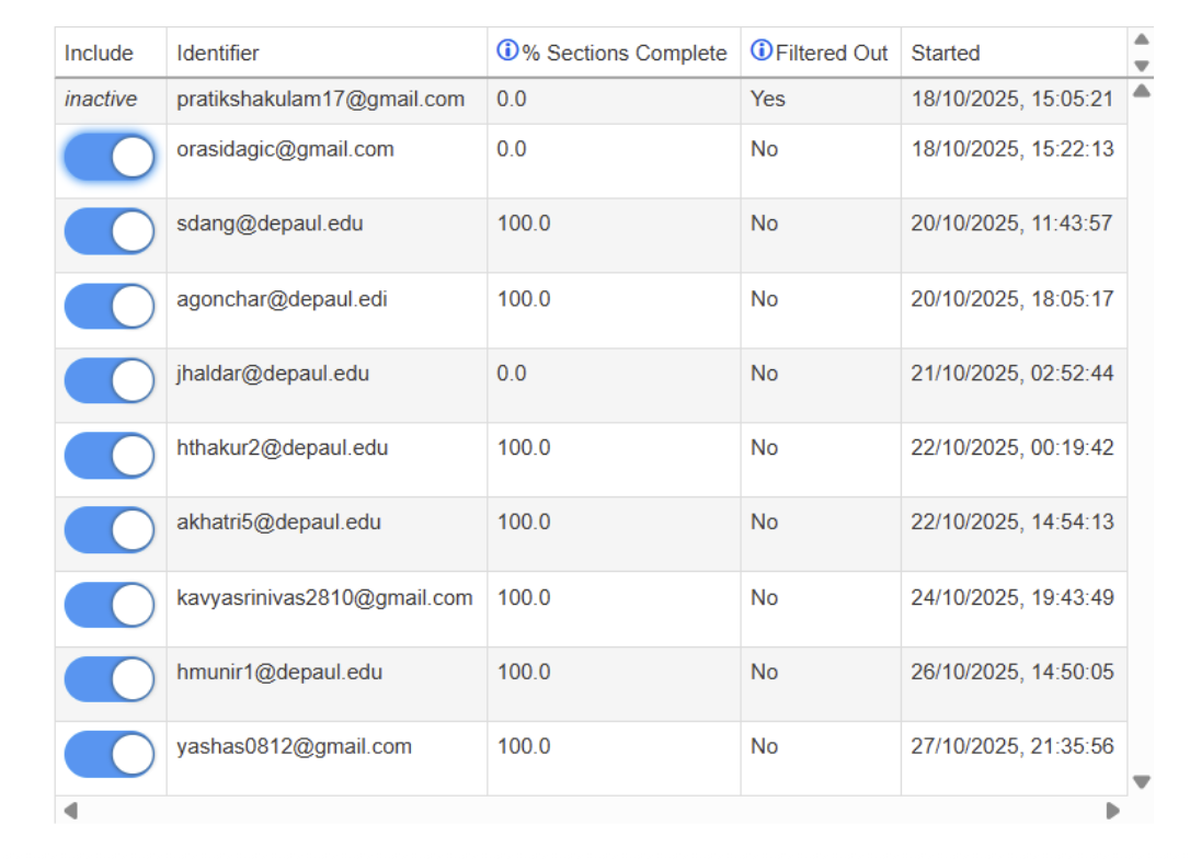
37 cards · 7+ participants · Hybrid open/closed via OptimalWorkshop

Usability Testing

Mid-fi prototype · 5 participants · Think-aloud · 4 core task flows

Card sorting research process

What the research kept telling us

Four recurring themes emerged across every method — interviews, observations, and testing.

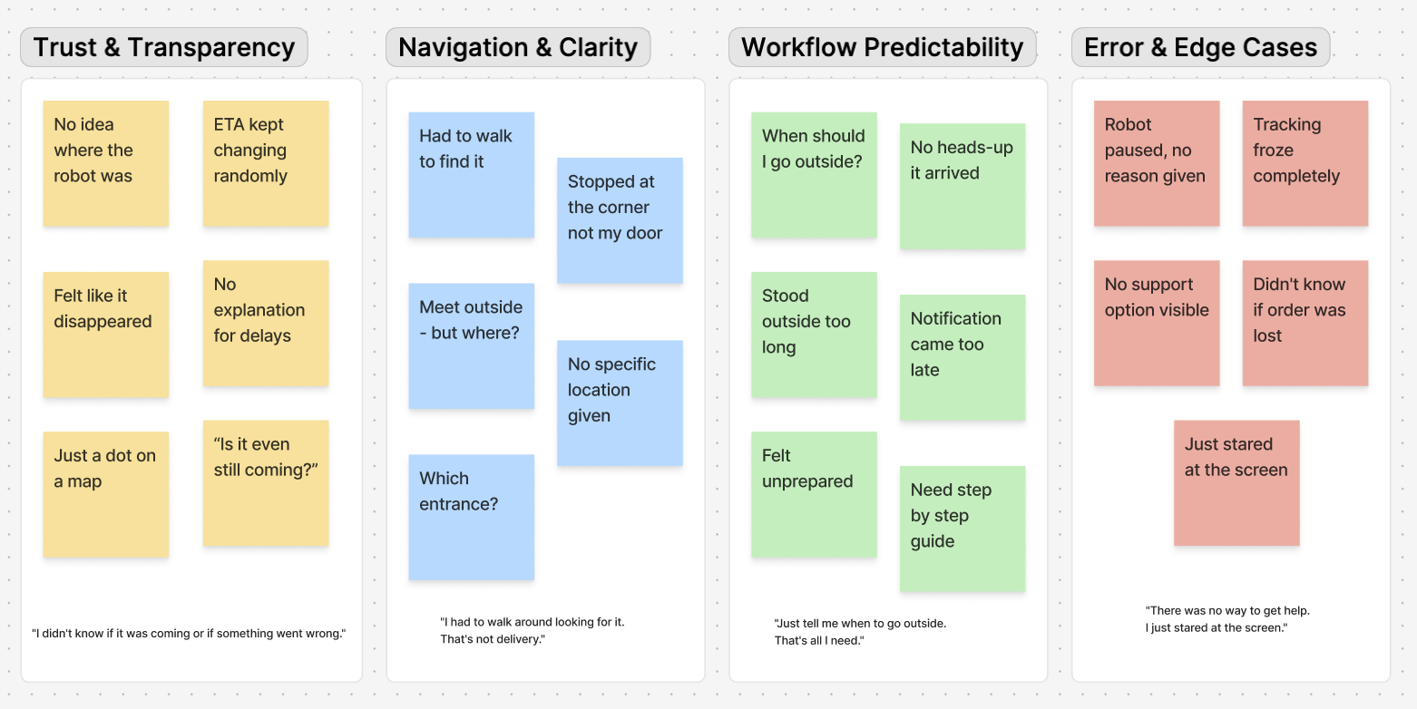
Affinity mapping clusters
01

Trust & Transparency

Users want clear statuses, updated ETAs, and confidence that robot will actually arrive. Every participant experienced anxiety from unclear robot status, not from the robot itself.

"I didn't know if it was coming or if something went wrong."

02

Navigation & Clarity

Users struggled with where to go and what to do at pickup. Drop-off ambiguity forced physical searching. Users walked down the street looking for robots parked at corners.

"I had to walk around looking for it. That's not delivery."

03

Workflow Predictability

Users needed simple, linear flows with confirmation at every step. The absence of proactive communication at key moments created disproportionate anxiety.

"Just tell me when to go outside. That's all I need."

04

Error & Edge Cases

When something went wrong like tracking froze, robot paused, ETA jumped and users had no path forward. No explanation. No support. No recovery. This single failure moment destroyed trust entirely.

"There was no way to get help. I just stared at the screen."

What we learned that shaped everything

Finding 01

The silence was the problem

All 4 participants reported anxiety from unclear robot status - not from the robot itself. When users understood what was happening, anxiety dropped immediately. Transparency is the product.

Finding 02

Drop-off forced physical search

Users had to walk down the street to find where the robot stopped. "Meet outside" means nothing when you're in a building with 3 entrances.

Finding 03

Trust collapsed without transparency

Users perceived the service as unreliable even when the robot performed perfectly. Perception of reliability was entirely driven by communication quality and not by actual delivery performance.

Finding 04

Two completely different journeys

Research revealed that senders (restaurants) and receivers (customers) had entirely different needs, tasks, and failure points. Both required distinct interaction models.

One finding that shaped the interface

37 cards sorted by 7+ participants revealed one critical mental model: users clearly separate "tracking what's happening" from "getting help when something goes wrong." These are two distinct cognitive modes — not one.

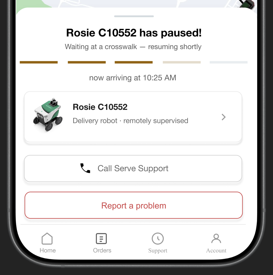
Design implication This directly informed our decision to give the error and pause state its own dedicated screen rather than embedding it as a small alert inside the tracking view. When something goes wrong, users need a completely different experience and not a banner on top of a map. Tracking is "tell me what is happening". Error handling is "something went wrong, what do I do now?". These are not the same moment and should not look the same.

37

cards · 7+ participants · OptimalWorkshop

Screen 2: Enhanced Tracking
"Tell me what is happening?"
Screen 4: Error and Pause State
"Something went wrong — what now?

5 screens that fill the silence

Designed within UberEats existing UI language — black, white, minimal. Conceptual redesign. Not affiliated with Uber Technologies or Serve Robotics.

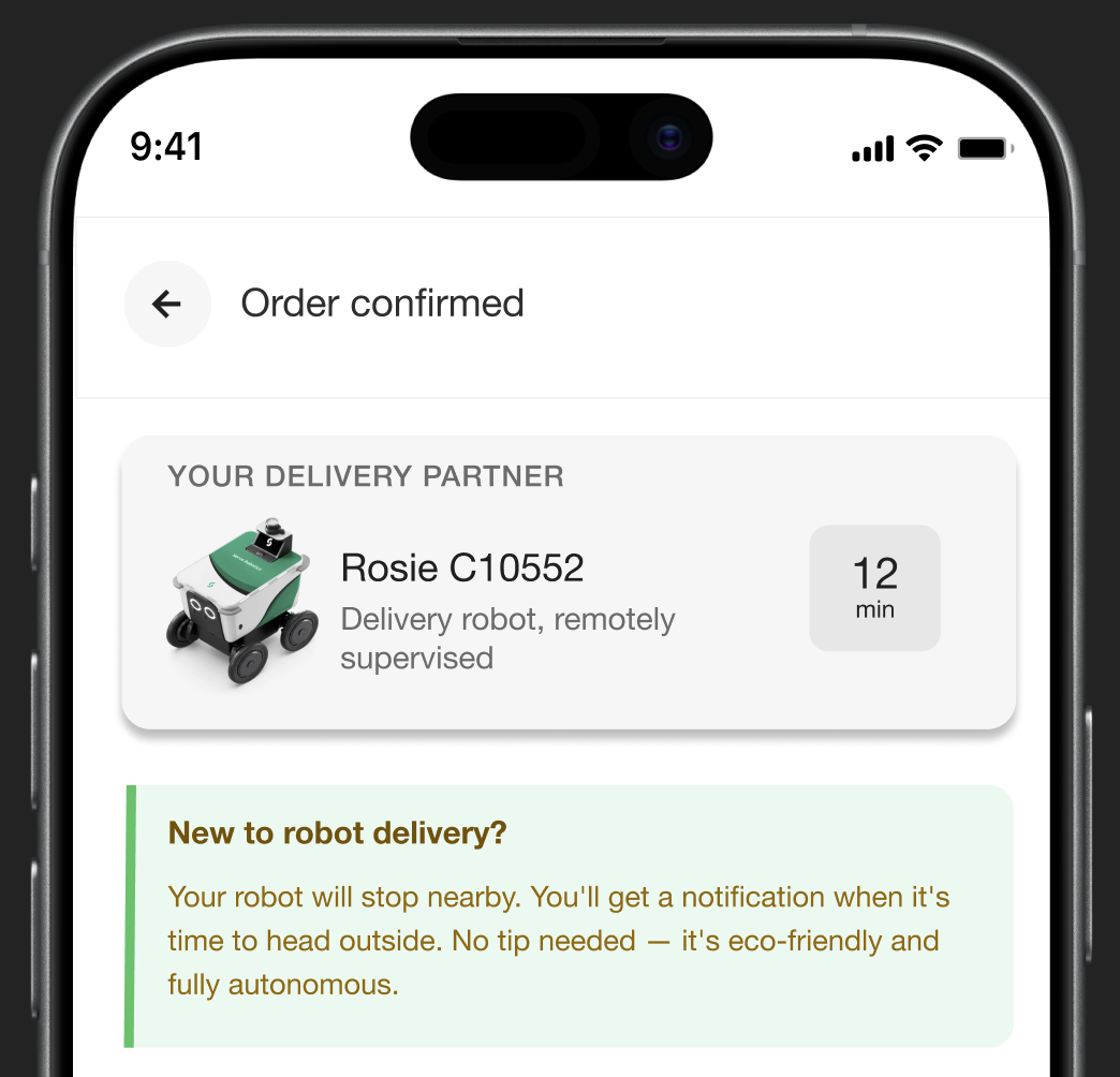
Robot Assignment screen

Screen 01

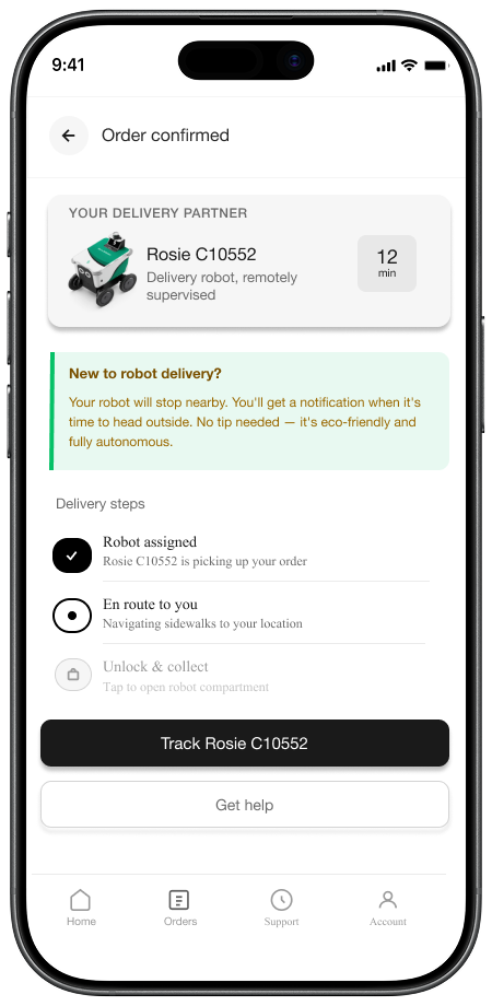
Robot Assignment

Robot identity card · ETA · education banner · 3-step progress indicator

Robot Assignment screen

Screen 02

Enhanced Tracking

Full route · 4-step progress bar · real-time status narrative

Robot Assignment screen

Screen 03

Robot Arrival

"Head outside" prompt · countdown · zoomed map · 3-step pickup guide

Robot Assignment screen

Screen 04

Error / Pause State

Transparent status · explanation · updated ETA · "Report a problem"

Robot Assignment screen

Screen 05

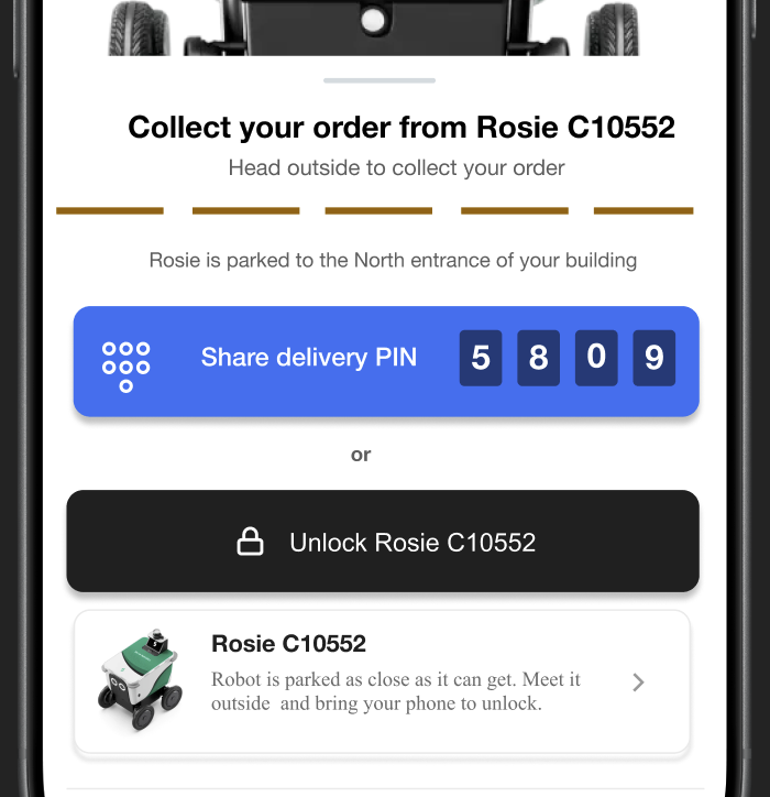
PIN + Unlock

4-digit PIN displayed · app-based alternative · countdown timer

Every screen solves a specific,
research-validated problem

Robot identity screen

Finding: Users trust what they can identify. Anonymity created anxiety.

Robot identity at handoff

Named the robot. Gave it an ID. Showed it as a specific, trackable entity — not a generic autonomous vehicle. Reduced perceived uncertainty immediately.

Proactive status screen

Finding: Silence was the primary driver of anxiety — not delays or errors.

Proactive status narrative

Replaced location-only tracking with a continuous status narrative. "Navigating the sidewalk", "2 minutes away — head outside." Users never had to wonder.

Dual unlock screen

Finding: Users with different abilities needed different interaction methods.

Dual unlock method

PIN code for code-based robots, app-based unlock for others. Directly addresses the accessibility gap.

Validated through testing

100%

Task completion rate on ordering and tracking flow

80%

Successful pickup instruction comprehension on first attempt

40%

Initial confusion around sender vs receiver prompts was resolved in final iteration

3

Design cycles of iteration based on testing feedback

Participant observations

"I need to know exactly when the robot arrives." — Participant 2
""I had no idea what was happening when it stopped." — Participant 4

The robot pause/error state caused the highest anxiety across all participants, confirming it as the most critical design opportunity and validating Screen 4 as essential, not optional.

Iterations made based on findings

  • Added proactive status narrative to tracking screen
  • Clarified pickup location with building-specific guidance
  • Added countdown timer on arrival screen
  • Designed transparent error state screen as standalone flow
  • Separated tracking and support into distinct surfaces

Design principles that scale
across any delivery platform

These 4 principles apply regardless of which platform integrates robot delivery — UberEats, DoorDash, Grubhub, or any restaurant app.

Robot identity at handoff

Name the robot. Give it an ID. Users trust what they can identify. Anonymity breeds anxiety.

Proactive status communication

Tell users what is happening before they wonder. Silence creates anxiety. Narrate the journey — not just the location.

Context-specific pickup guidance

Robot pickup is fundamentally different from human delivery. Guide users exactly where to go, what to look for, and what to do.

Graceful error recovery

Explain delays clearly. Give users a path forward. Never leave anyone especially disabled users in silence when something goes wrong.

UberEats DoorDash Grubhub Instacart Restaurant apps

Reflection

"Great UX isn't always about adding features. Sometimes it is about filling the silence between them. And sometimes it is about making sure that silence doesn't exclude the people who need the loudest voice."

This project started as a question about trust and ended as a question about equity. Robot delivery has the potential to be genuinely life-changing for people who struggle to leave their homes — disabled users, elderly users, people with severe anxiety.

The Serve Robotics incident with Mark Chaney wasn't just a hardware failure. It was a design failure — a failure to consider who uses the sidewalk and what they need from a robot sharing that space.

Conceptual redesign. Not affiliated with Uber Technologies, DoorDash, or Serve Robotics.

MoodMode case study preview

Next project

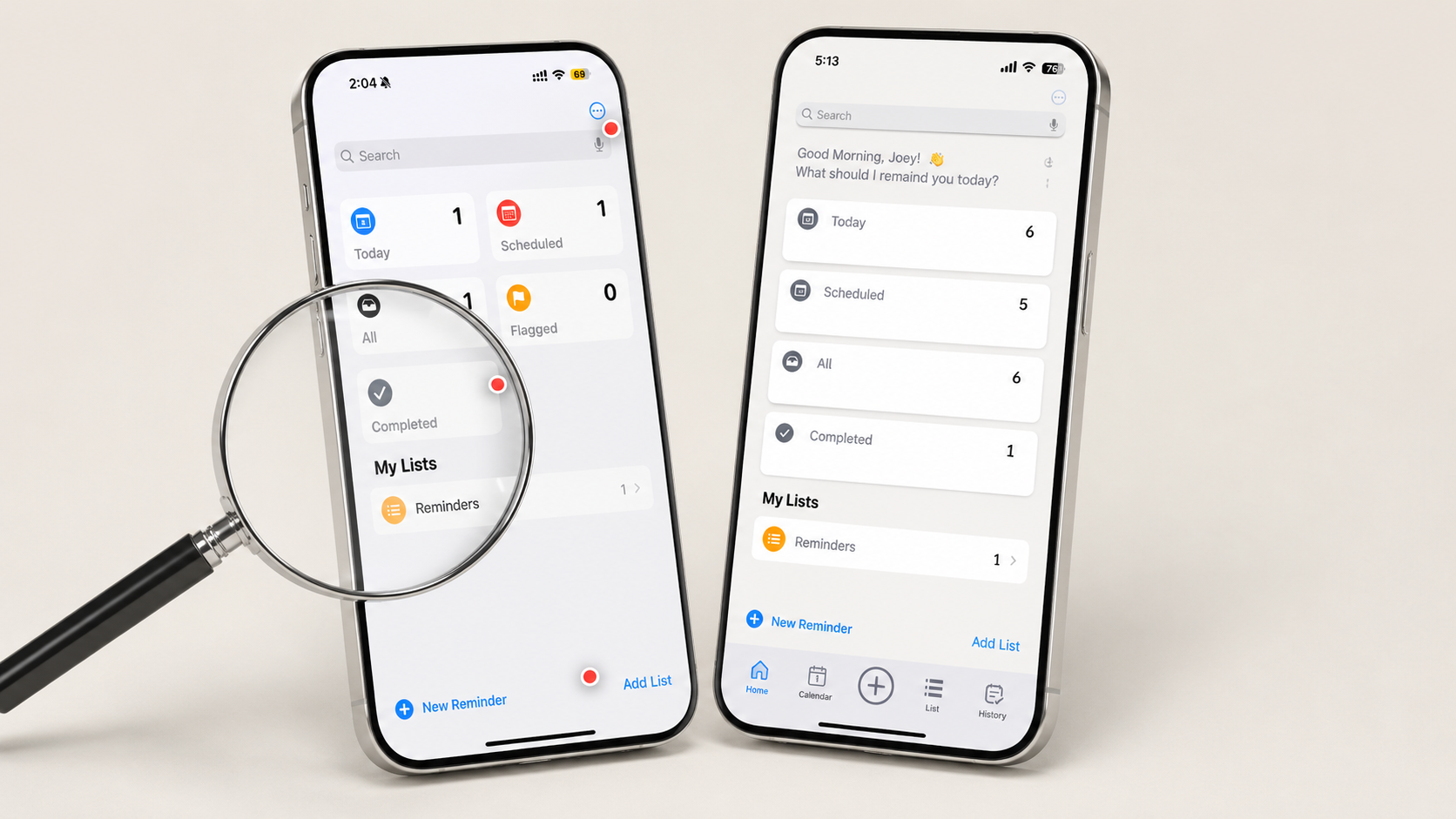
Apple Reminder Redesign - 10+ Heuristic Gaps found!

View case study →